Capture sessions and the thoughts behind them
Keep practice, match, league, and tournament notes together while the details are fresh.
Notes, tags, photos, and favorites give useful moments enough context to find again.
Chalkboard keeps your pool sessions, scores, notes, table layouts, and afterthoughts together, so the useful parts of today’s play are still clear next time.
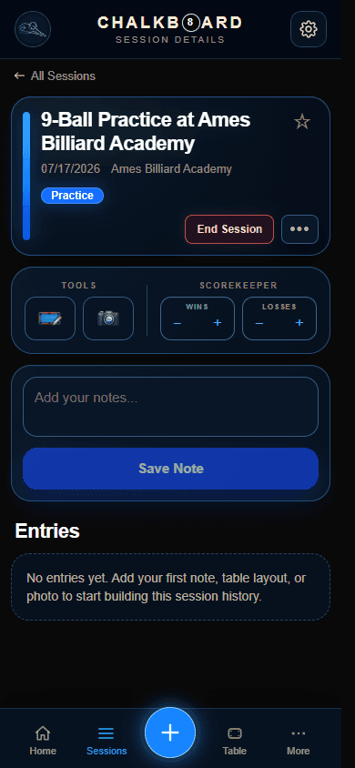
Start with a simple session record, then add only the context that will make it useful later.
Keep practice, match, league, and tournament notes together while the details are fresh.
Notes, tags, photos, and favorites give useful moments enough context to find again.
Record what happened without separating the result from what you learned at the table.
Use the scorekeeper during play, then add a result and afterthoughts when the session ends.
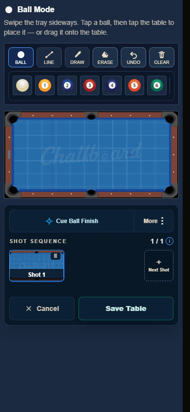
Save the table position when words alone will not preserve a decision or pattern.
Create a standalone layout or connect one to a session, including cue-ball finish context.
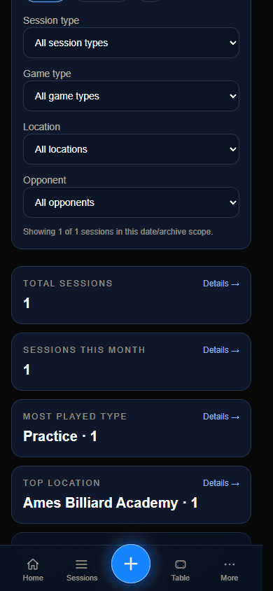
Revisit favorite notes, recurring patterns, session history, and useful trends over time.
Sessions, Table Library, and Stats & Insights keep review focused instead of scattered.
Chalkboard supports the loop without asking you to document every shot or turn every session into analysis.
Start with the session in front of you.
Save the score, layout, or thought that matters.
Return later with the full context intact.
Carry a clearer decision into the next session.
Each part of Chalkboard has a focused job, from starting quickly to finding a pattern across past sessions.
New Session
Get from arrival to a useful record in a few taps.
Use quick natural-language entry or choose manual details for practice, a match, league night, or a tournament.
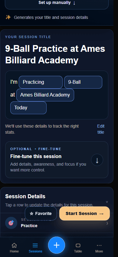
Active Session
Capture the moment without turning play into paperwork.
Add notes, tags, photos, favorites, layouts, and results; use the scorekeeper when the set calls for it.
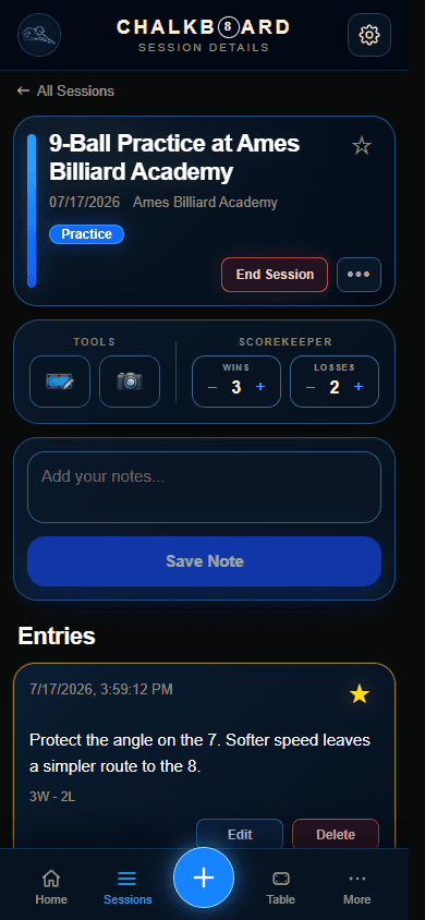
Table Library
Preserve decisions and shot sequences visually.
Build standalone or session-linked layouts and document the intended cue-ball finish for later review.
Stats & Insights
Notice what deserves attention next.
Revisit activity, results, and patterns alongside Sessions and Favorite Notes while keeping the full session context close.
Invited private-alpha players can use the web app or install the signed Android release.
Web App
Private alphaThe current product experience for invited players. Sign in with your existing private-alpha access.
Open Web AppAndroid
Signed APK availableDownload the permanent signed release for Android 7.0 or later. Chalkboard account access remains invite-only during private alpha.
Download for AndroidNew to Chalkboard?
Follow the full flow through actual Chalkboard screens, from starting a session and saving one useful note to tables, review, and exports.
No sign-in is needed to explore the 13-step walkthrough.
Latest update